How a bold digital revamp elevated Okieco's customer engagement and experience
ROLE
Designer & Developer
TIMELINE
Nov - Dec 2024
SKILLS
Web design
Visual design
Research & audit
OVERVIEW
Okieco is a Singapore-based dessert brand known for its playful spin on New York-style banana pudding. I was brought in to redesign their website to improve clarity, streamline the ordering process (especially on mobile) and create a fun, bold first impression for new customers.
"Her fresh ideas and attention to detail - all while ensuring that the design is suited to our brand image - resulted in a website that is visually appealing and easy to navigate. Furthermore, she truly elevated the mobile site viewing experience for site visitors, easing the process of mobile ordering without a hiccup!"

Siti, Founder of Okieco
OUTCOMES
40% increase
organic search sessions
30% increase
unique visitors
THE CHALLENGE
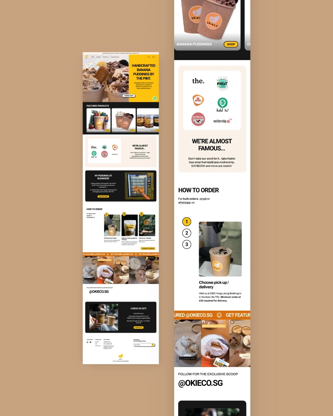
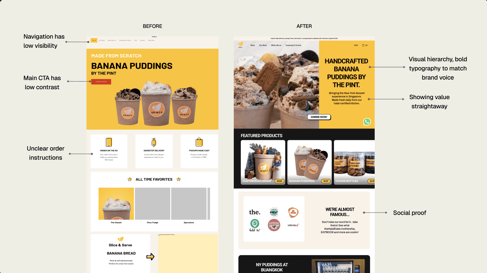
Okieco’s original website, built on a DIY platform, served its early e-commerce needs but this left both customers and the founder frustrated. Ordering was difficult, especially on mobile, with unclear navigation and pickup instructions.
How might we create a mobile-first e-commerce experience that reduces friction but keeps the flavor and personality of the brand?
RESEARCH & INSIGHTS
As a small local business, Okieco came with its own set of constraints — limited analytics and a separate e-commerce system. I focused on the non-commerce pages, where I uncovered key pain points: poor navigation hierarchy, unresponsive mobile layouts, and unclear pickup details. Many loyal customers skipped the site entirely, choosing to order via WhatsApp instead — a clear sign the digital experience wasn’t meeting their needs.
Key insight: The site’s UX was getting in the way of loyal customers and needed to be restructured to reflect how people were already trying to order.
SOLUTIONS
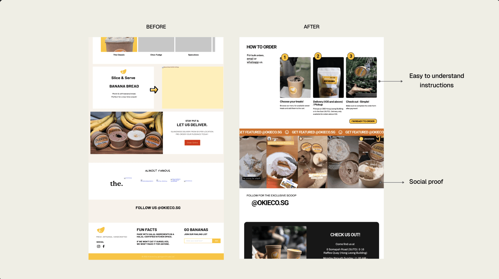
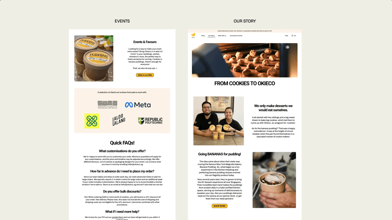
Here are some of the key screens and changes. With B2B clients, from corporate events to wedding parties, as a secondary audience, Okieco needed event and corporate pages that stood out. I focused on packing these with clear information, strong social proof, and an ‘About’ page that told their story in a way that felt true to the brand
REFLECTION
This was my first design project, and it taught me how to move fast and stay focused. With just a month to deliver, I made quick decisions and gathered feedback early. It was a crash course in balancing speed with clarity to make sure the site worked well, felt true to the brand, and made ordering easier. With no data to back up my decisions, I felt a little insecure at times, but it was the perfect stage to just try. That experience gave me a solid foundation in designing with both users and business needs in mind.